Data visualization tools play a pivotal role in transforming raw data into compelling visuals that resonate with audiences. When creating a pitch deck, presenting data effectively can mean the difference between securing investor interest and losing it.
Visuals are processed 60,000 times faster than text, making them an essential element for conveying complex information quickly and persuasively. Harnessing the best tools for creating pitch decks can simplify the process while ensuring impactful visualizations.
This blog will explore how pitch deck creators can select and use data visualization tools to craft engaging presentations. Whether you're showcasing market trends or financial projections, the right tools can turn intricate data into clear, actionable insights. Let’s jump right in!
Top Visual Tools to Elevate Your Pitch Deck
Creating a compelling pitch deck requires more than just data—it demands visuals that captivate and communicate effectively. Cost-effective data visualization tools can transform complex financial figures into engaging narratives, ensuring your message resonates with investors.
1. Advanced Photo Editors for Creative Flair
Visual appeal plays a critical role in grabbing attention. Tools like PicsArt offer design templates that can add creative flair to your pitch deck. Whether you’re designing cover slides or enhancing charts, PicsArt simplifies the process with customizable options. Utilize PicsArt’s design templates to elevate your visuals and make your pitch stand out.
2. Infographic Makers for Simplified Data
Complex data often overwhelms audiences. Platforms such as Canva and Pictochart specialize in converting intricate information into attractive infographics. These tools allow startups to present statistics and trends in a visually digestible format, ensuring key points are memorable. Visuals are processed 60,000 times faster than text, making them an essential element for impactful presentations.
Presentation Software for Dynamic Slides
Dynamic presentations can make or break a pitch. MS PowerPoint and Google Slides enable users to create custom layouts and animations that bring ideas to life. Use dynamic slides to deliver a visually compelling investment pitch that keeps audiences engaged.
Specialized Data Visualization Software
For data-heavy presentations, specialized tools like Tableau and Microsoft Power BI are invaluable. These applications convert intricate financial data into interactive visual narratives, allowing investors to explore insights in real-time. Such tools are particularly effective for presenting forecasts, growth metrics, and ROI projections.
Video Editing Solutions for Storytelling
Video content adds a dynamic layer to pitch decks. Adobe Premiere Pro enables startups to craft captivating videos that tell their investment story effectively. From showcasing customer testimonials to illustrating product functionality, videos can create an emotional connection with the audience.
The Importance of Data Visualization in Pitch Decks
Capturing an investor's attention often hinges on how effectively information is presented. Data visualization tools play a pivotal role in transforming complex datasets into clear, engaging visuals that resonate with audiences. By presenting information visually, pitch decks can simplify intricate concepts, ensuring key insights are easily understood and remembered. For instance, visual information is processed 60,000 times faster than text, making it a powerful medium to ensure critical messages stick.
Simplifying Complexity for Clarity
Investors are often inundated with data-heavy presentations, and deciphering dense spreadsheets or lengthy paragraphs can be overwhelming. Data visualization tools allow presenters to distill large datasets into digestible charts, graphs, and infographics. This not only saves time but also enhances the clarity of the narrative, enabling investors to grasp trends and market opportunities at a glance.
Strengthening Storytelling
A compelling pitch deck is more than just numbers; it’s a story. Visuals empower storytelling by highlighting patterns, growth trajectories, and market gaps that align with the presenter’s vision. For example, a well-designed graph showcasing revenue growth over time can underscore a startup’s potential, making the narrative more persuasive and relatable.
Building Credibility
Clear and accurate visuals instill confidence in the data being presented. When investors see thoughtfully designed charts and graphs, it signals professionalism and meticulous preparation. This credibility can significantly influence their decision-making process, as it demonstrates that the presenter values transparency and precision.
Enhancing Engagement
Too much text can disengage an audience, while visuals can captivate and hold their attention. By reducing text overload and incorporating striking visuals, pitch decks become more dynamic and memorable. A strong pitch deck begins with understanding how to create a pitch deck tailored to your goals and audience.
Data visualization tools are not just aesthetic enhancements; they are strategic assets that elevate the impact of a pitch deck. By simplifying complexity, supporting storytelling, and boosting engagement, they ensure presentations leave a lasting impression on investors.
Case Study: Data Visualization Impact in a Pitch Deck
A fintech startup’s pitch deck offers a striking example of how data visualization tools can transform complex datasets into compelling narratives. By employing illustrative techniques, the startup effectively captured investor attention, simplifying intricate financial data into digestible visuals that told a persuasive story.
One standout feature of this pitch deck was its use of interactive data visualization software. Through dynamic charts and graphs, the startup demonstrated key financial metrics, such as projected revenue growth and customer acquisition rates, in a visually engaging format. These tools not only reduced data complexity but also allowed investors to grasp critical insights at a glance, fostering deeper engagement.
Additionally, the pitch deck integrated best data visualization tools to highlight market opportunities. For instance, a heat map was used to showcase geographic expansion potential, while a comparative bar chart illustrated the startup’s competitive edge in transaction processing speed. These visuals were strategically placed to align with the narrative flow, ensuring that each slide reinforced the overarching message of scalability and profitability.
Incorporating pitch deck design principles ensures that visual elements align with your narrative, making your presentation more compelling. This approach, as seen in the fintech case study, underscores the importance of harmonizing aesthetics with data clarity.
For startups aiming to stand out, this case study demonstrates how effective data visualization can bridge the gap between raw data and investor understanding. By transforming numbers into stories, pitch decks can inspire confidence and drive decision-making.
Effective Techniques for Visualizing Data in Your Pitch Deck
Presenting data effectively in a pitch deck can transform raw numbers into compelling insights. With the right data visualization tools, you can create visuals that resonate with your audience and enhance your message. Below are actionable techniques to ensure your data visuals are clear, engaging, and impactful.

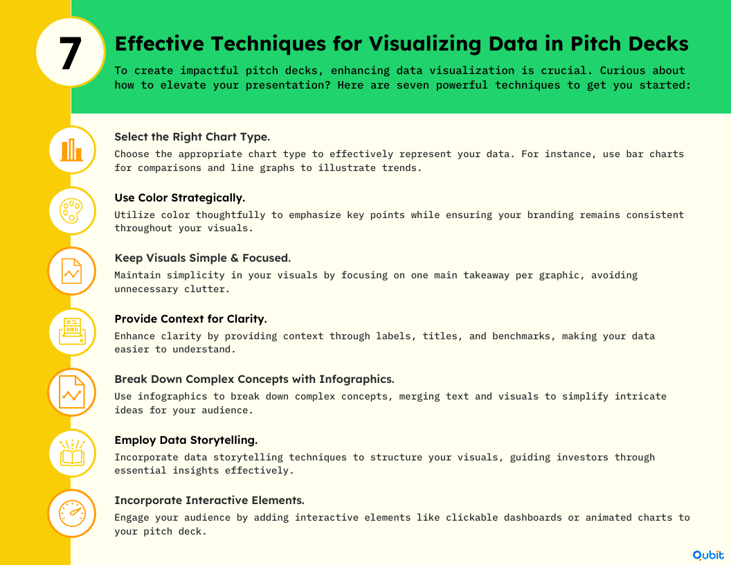
1. Select the Right Chart Type
Choosing the correct chart type is essential for communicating data effectively. Bar charts work well for comparisons, while line graphs are ideal for trends over time. Pie charts can highlight proportions but should be used sparingly to avoid clutter. For hierarchical data, consider tree maps or bubble charts. Matching your chart type to the data ensures clarity and prevents misinterpretation.
2. Use Color Strategically
Color plays a vital role in emphasizing key data points and reinforcing branding. Highlight critical metrics with contrasting colors to draw attention. For instance, use your brand's primary colors to maintain consistency throughout the pitch deck. Avoid overloading visuals with too many hues, as this can distract from the message.
3. Keep Visuals Simple and Focused
Simplicity is the cornerstone of effective data visualization. Overloading charts with excessive data points or unnecessary design elements can dilute your message. Stick to one key insight per visual and remove any extraneous information. A clean, focused design ensures your audience grasps the main takeaway quickly.
4. Provide Context
Contextualizing your data with labels, titles, and benchmarks enhances comprehension. For example, adding a title that explains the chart's purpose or including benchmarks for comparison can make the data more relatable. Without context, even the most visually appealing charts may fail to convey their intended meaning.
5. Break Down Complex Concepts with Infographics
Infographics are ideal for simplifying intricate ideas. They combine text, visuals, and icons to create digestible representations of complex data. For example, if you're explaining a multi-step process or showcasing interconnected metrics, an infographic can make the information more accessible and engaging.
6. Employ Data Storytelling
Transforming raw data into a compelling narrative can captivate your audience. Start by identifying the story your data tells—whether it's growth, opportunity, or impact. Then, structure your visuals to guide viewers through the narrative, ensuring each chart or graphic builds upon the previous one. This approach makes your pitch deck memorable and persuasive.
7. Incorporate Interactive Elements
Interactive elements are particularly effective in digital presentations. Features like clickable dashboards or animated charts allow audiences to explore data on their own, fostering engagement. These modern touches can make your pitch deck stand out, especially when presenting to tech-savvy investors.
Streamline Your Pitch Deck Creation
Using pitch deck templates free download can streamline the creation process while maintaining professional standards. These templates provide a solid foundation for integrating data visualization tools seamlessly into your deck.
Avoiding Common Mistakes in Pitch Deck Data Visualization
Effective data visualization tools can transform a pitch deck into a compelling narrative, but common mistakes often undermine their impact. Avoiding these pitfalls requires attention to detail and a clear understanding of your audience's needs.
1. Overloading Visuals with Excessive Data
Attempting to include too much information in a single visualization can overwhelm viewers. Instead, focus on one clear message per chart or graph. Highlight the most critical data points and ensure they align with your pitch deck's overall narrative.
2. Misleading Scales and Chart Types
Misrepresentation of data through improper scales or unsuitable chart types can erode trust. For example, using a truncated y-axis may exaggerate trends, leading to misinterpretation. Always select chart types that accurately reflect your data's context and avoid distorting its meaning.
3. Ignoring Mobile Optimization
Pitch decks are often viewed on mobile devices, making optimization crucial. Ensure your visuals are legible on smaller screens by using high-contrast colors, readable fonts, and simplified designs.
4. Inconsistent Styling
A cohesive design strengthens your pitch deck's professionalism. Avoid mismatched fonts, colors, or layouts across slides. Consistent styling enhances readability and reinforces your brand identity.
5. Accessibility Oversights
Failing to account for accessibility can alienate potential investors. Use color-blind friendly palettes and provide text alternatives for graphs. These adjustments ensure inclusivity and broaden your audience reach.
6. Over-Reliance on Generic Templates
While templates can save time, they often lack personalization. Custom designs tailored to your pitch deck's unique goals can deliver a stronger impact. Choosing between pitch deck templates vs custom design depends on your need for personalization and time constraints.
Conclusion
Throughout this blog, we've explored essential strategies for creating impactful pitch decks, emphasizing the power of a clear, narrative-driven approach combined with effective data visualizations. By structuring your presentation around a compelling story, you make your startup's value easier for investors to grasp. Incorporating thoughtfully chosen visuals not only strengthens your key points but also helps investors quickly understand your growth potential.
Now it's your turn—apply these actionable insights and recommended tools to elevate your pitch deck and confidently communicate your vision. Crafting an engaging, investor-focused presentation is an important step toward securing funding.
Ready to create a pitch deck that stands out? Discover how our Pitch Deck Creation service can transform your investment pitch through compelling visuals. Let's create a pitch deck that secures funding.
Key Takeaways
- Data visualization transforms complex pitch deck information into engaging visuals.
- Using the right tools and techniques is essential for investor engagement.
- Strategic color use and interactivity enhance clarity and memorability.
- Avoid common pitfalls by focusing on simplicity and context.
- Real-world case studies and practical tips drive home the effectiveness of visual storytelling.
Frequently asked Questions
Is PowerPoint a data visualization tool?
Yes, PowerPoint can function as a data visualization tool. By integrating customized charts, graphics, and interactive elements, it allows users to create visually engaging presentations. For instance, dynamic slides can significantly enhance the impact of a pitch deck.


 Back
Back


